---- inofficial note ---- the official notes are here -----
.
process markups
A copy&paste of e-mails between collaborateurs and editor
from marcus to dorothee:
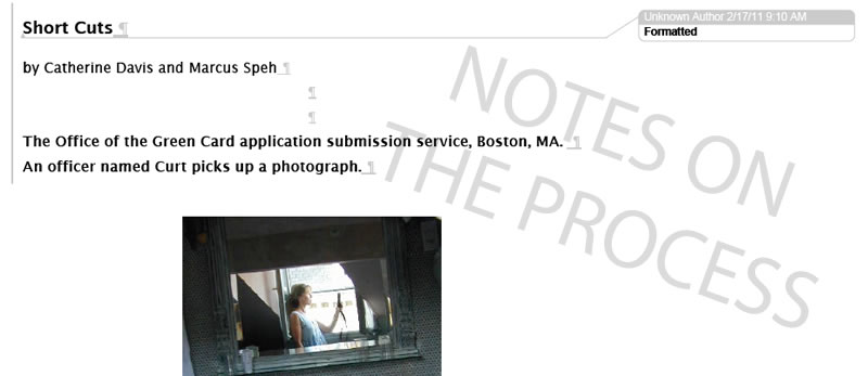
"short cuts" came out of a submission of catherine davis' photograph to marcus speh's one thousand shipwrecked penguins project. within a few days, a story around the photo and the text on the back of the photo was created wrapped in a conversation between the artists and a couple of fictitious immigration officers. what we send you here is a set of scenes from a modern "green card" alliance between two artists and their multi-colored toothbrushes. transformation is present in the process, in the photo, in the piece of writing itself, inseparable from the individual, the collaboration and the three cultures addressed and involved.
if you don't care for the wrapping, we would offer you the core (photo + flash) instead - let us know.
from dorothee to marcus:
ich bin gerade am Collab-issue. Short Cuts ist spannend, auch vom Format. ich möchte das Format auf jeden Fall so original wie möglich übernehmen, und würde daher Eure Seiten als in Bild umgewandelte Originaldaten einbinden,
das wäre dann ein ganz neues Format für BluePrintReview. from marcus to dorothee:
du meinst mit den "formatiert...gelöscht" informationen? finde ich spannend...hat sowas von work in progress. das fluidum kommt gut rüber. finde ich - wie immer bei dir - innovativ und interessant. muss mal catherine fragen, was sie meint.. from cathrine to dorothee:
I really like your notion of the formatting mark-up, especially as it relates to construction and the concept of blueprint. Ingenious! It occurs to me upon viewing the draft, that a further separation between "the frame" and "the matter" might enhance (and clarify) the concept. That is, the formatting marks might be scaled to a faint gray - or even blue, as in blueprint! - in a less bulky font (for the markup) and perhaps even cheated adjusted a bit: such as removing the large left-hand vertical lines? In this way, the essence of the concept is subtilely rendered but still quite clear. (The lingering imprint, the shadow, the residue of formatting marks....) Such a separation creates another level for the reader, and I think would facilitate access to this collaborative piece. I'm including a quick example I made - here the mark up is simply the standard available in my Word program, and I'm sure you could improve upon.
~
back to the final Short Cuts |